
Mint.com Usability Study
Usability Study, Heuristic Evaluation, Qualitative Data Coding
Jump to: 01. Define - 02. Plan - 03. Test - 04. Analyze - 05. Summary of Findings - 05-a. High Severity Issues - 05-b. Medium Severity Issues - 05-c. Low Severity Issues
Summary


This is a student-led usability study of Mint.com's budgeting feature. The objective of the study is to uncover potential design concerns and identify areas of improvement for key tasks involved in creating and tracking a budget. The study focused on the desktop version of the application.
The cards above represent the steps we took to conduct the study and the sections below dive deeper into each step.
My Role
The research team was comprised of four grad students. Each team member participated in all activities, and I paid special attention to heuristic evaluation, conducting interviews, coding qualitative findings, and synthesizing findings.
- Project Management: Created timeline, assigned tasks, set meeting agendas, ran affinity mapping exercise.
- UX Research: Conducted heuristic evaluation, drafted interview questions, conducted interviews, coded qualitative findings, synthesized insights.
01. Define
We conducted a heuristic evaluation using 10 Usability Heuristics by Jacob Nielsen to uncover main areas of concern. We used the results of the evaluation to come up with the study objectives and research questions.
Study Objectives
- To assess the ease and effectiveness of creating a budget and whether the process matches the participants’ mental model of budgeting.
- To determine obstacles to key activities: create a budget, adjust the budget, and compare spending against the budget.
- To measure a level of satisfaction with the overall budgeting experience on Mint.com and determine areas of improvement.
02. Plan
Participants
The study included 6 participants that have an online banking account and have not used Mint.com in the past year. Participants included a mix of ages and various levels of self-reported budgeting experience.
Methodology
Testing equipment included a laptop with Internet access and Morae software to record the screen, participant’s facial expressions, and audio. A test Mint.com account was created and populated with test financial transactions. During each session, one moderator was present to explain the scenario to the participant. One dedicated notetaker took notes, and two additional notetakers/observers were present to observe and collect data. The account and transactions were reset after each session.
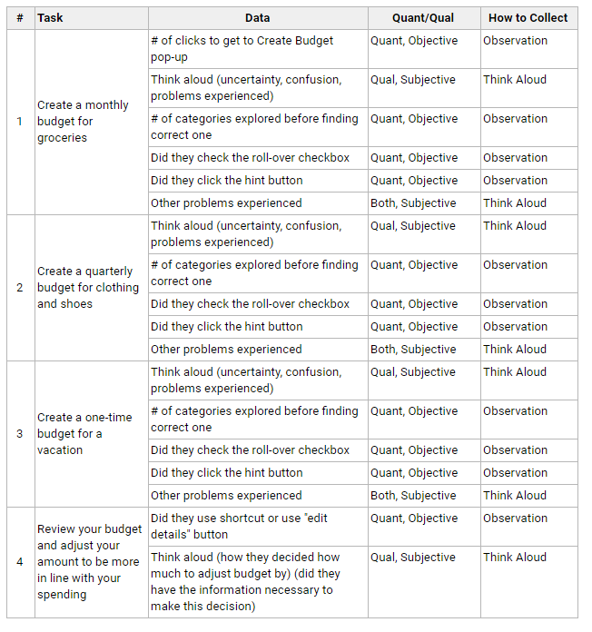
Tasks and Metrics
Here is a portion of the tasks and metrics grid created for the test.
03. Test
Study sessions spanned three days with 2-3 one-hour long sessions per day. The sessions were conducted on the University of Washington's campus, and one session took place at the home of one of the team members. Participants were given 5 scenarios to complete on Mint.com site using a laptop.
Data Collection Instruments
The following instruments were used to collect data:- Screening Questionnaire covering demographic info to qualify participants
- Pre-Study Questionnaire to determine the budgeting approach and motivations
- Five Scenarios using Thinking Aloud Protocol and post-scenario ratings
- Post-Study Questionnaire covering overall satisfaction and any issues encountered
04. Analyze
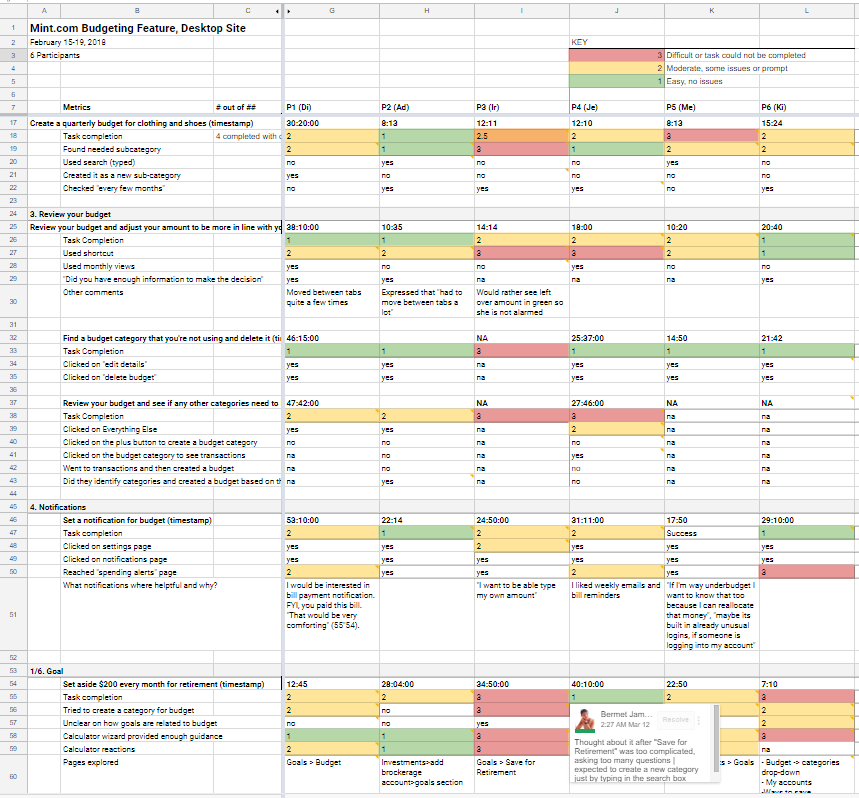
Metrics from the scenarios and qualitative interview notes were coded and analyzed. Additionally, we conducted an affinity mapping exercise to find common themes and cross-cutting issues.
05. Summary of Findings
Positive Findings
Our usability study revealed several positive findings:- Budgets are easy to create. 5 out of 6 participants were able to create their budget quickly and easily. On average, participants rated the scenario related to creating the budget as Somewhat Easy (2) on a 5-point Likert scale.
- Notifications feature is useful. 5 out of 6 participants appreciated having the ability to receive alerts of any unusual transactions, when their balance is low, and when their spending exceeds the budget.
Summary of Usability Issues
The table below summarizes all usability findings, severity ratings, and recommendations. We used a three-level rating to rank the severity of the issues:- High - Leads to task failure or significant delay in completion. Causes extreme irritation.
- Medium - Causes occasional task failure in some users. Causes medium annoyance.
- Low - Results in some hesitation during task completion. Causes minor irritation.
05-a. High Severity Issues
Goals Are Not Easy to Find
One of the biggest issues we have noticed was on the “Set aside money for savings” task — participants were not clear about the difference between Goals and Budgets. 3 out of 6 people ended up creating a budget item for “Retirement” rather than creating a Goal.
- Severity Rating: High
- 5 out of 6 participants had difficulty finding where to create a goal
- 3 out of 6 participants have created or attempted to create a new budget category for the retirement goal
- 2 out of 6 participants have mentioned that they are “not sure how to do that” and that they “are stuck.”
Recommendation
- Combine goals and budgets
- Feature goals more prominently on the budget page
- Provide more guidance upfront what is involved in setting up a goal
Here is a video of one participant trying to set up a retirement goal:
“So I don’t automatically see something that would be ‘retirement,’ which seems like a pretty big category…”
Finding Categories was Confusing
Another task which participants spent a lot of time on was creating a budget for clothing. While they were able to create the budget easily, they struggled with finding the clothing category. Mint.com does have searchable categories, but this was not apparent to 4 participants who ended up getting pretty frustrated with this step.- Severity Rating: High
- 4 out of 6 participants were confused about IA of the categories, and felt that the list was too long
- 4 out of 6 participants did not notice the search functionality
Recommendation
- Emphasize the search functionality of the categories
- Make it clear when a new subcategory is added
- Further research to find an optimal organization and design of categories
And here we have a very astute observation from another participant.
“Let’s see...there’s a lot of categories (chuckles nervously)”
Calculations Were Confusing
In addition to confusion with subcategories, participants were confused by some math calculations that were performed behind the scenes. For an app that deals with money it is pretty important to be very transparent and on point with math, so when participants couldn’t understand how certain numbers were calculated it stumped them. Some participants didn’t agree with some assumptions on the goals page wizard (that allows you to calculate your retirement amount, home mortgage, etc.).- Severity Rating: High
- 3 out of 6 participants weren’t sure how amounts were calculated or what assumptions were used
- 2 out of 6 participants were confused by the calculation when setting budgets that span several months
Recommendation
- Clarify how calculations are made, and any assumptions used
Here is a participant trying to set a budget that spans several months.
“I would expect it will automatically add 3 months to my current month. Where does the $50 come from?”
05-b. Medium Severity Issues
Interface Was "Overwhelming"
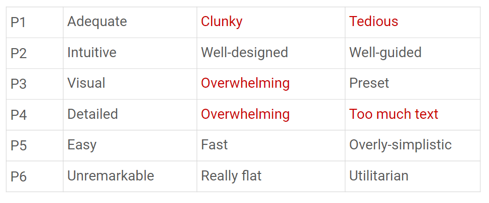
Participants have found the interface to be overwhelming and clunky- Severity Rating: Medium
- 3 participants have described their experience with the application as “overwhelming” (P3, P4), and “clunky” (P1)
- 1 participant expressed that they had to jump between tabs a lot when adjusting a budget
Recommendation
- Streamline interface by reducing the amount of information users see at once
- Provide an overview of the entire process by giving users a roadmap
When asked to describe their experience using Mint.com here is a table of the words used by our participants.
Navigation Menu Has Too Many Options
- Severity Rating: Medium
- 5 out of 6 participants were confused about navigation terminology, would have to explore each page to learn more
Recommendation
- Rename navigation tabs
- Grouping the 16 top-level tabs to its main functions so it is easier to navigate

Light-Blue Text Not Legible
- Severity Rating: Medium
- 1 participant felt that some text is too small or does not provide enough contrast
Recommendation
- Use larger text and provide more contrast between text and background
- This would also be a consideration for visually-impaired users
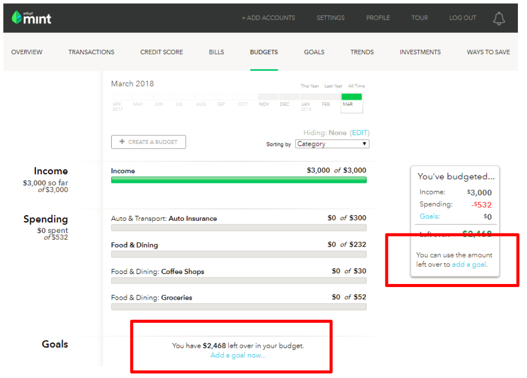
The snapshot below shows that the light blue color text didn’t provide enough contrast.
05-c. Low Severity Issues
Emotional Design
While not a usability issue, we have heard this from 3 participants and decided it was worth including with a low severity rating.
- Severity Rating: Low
- 3 out of 6 participants mentioned that budgets make them “feel guilty” (P4), aren’t “flexible enough” (P5), and they will have to “change their behavior” (P6)
- 2 participants have described that application “felt like a chore” (P1) and was “no fun” (P6).
Recommendation
- Consider making the visual design more engaging
Additional Areas to Explore
While we tested only budgeting feature of the site, here are additional comments we've heard from the participants.Goals Wizard
- “Goals” wizard modal had a lot of information.
Notifications
- Participants are interested in a diversity of notification options (over budget, approaching budget)
- Participants mentioned wanting to set custom amounts for low balance notifications, instead of fixed ones offered currently.
- Participants wanted a text message option in the notifications preferences.